New Logo!
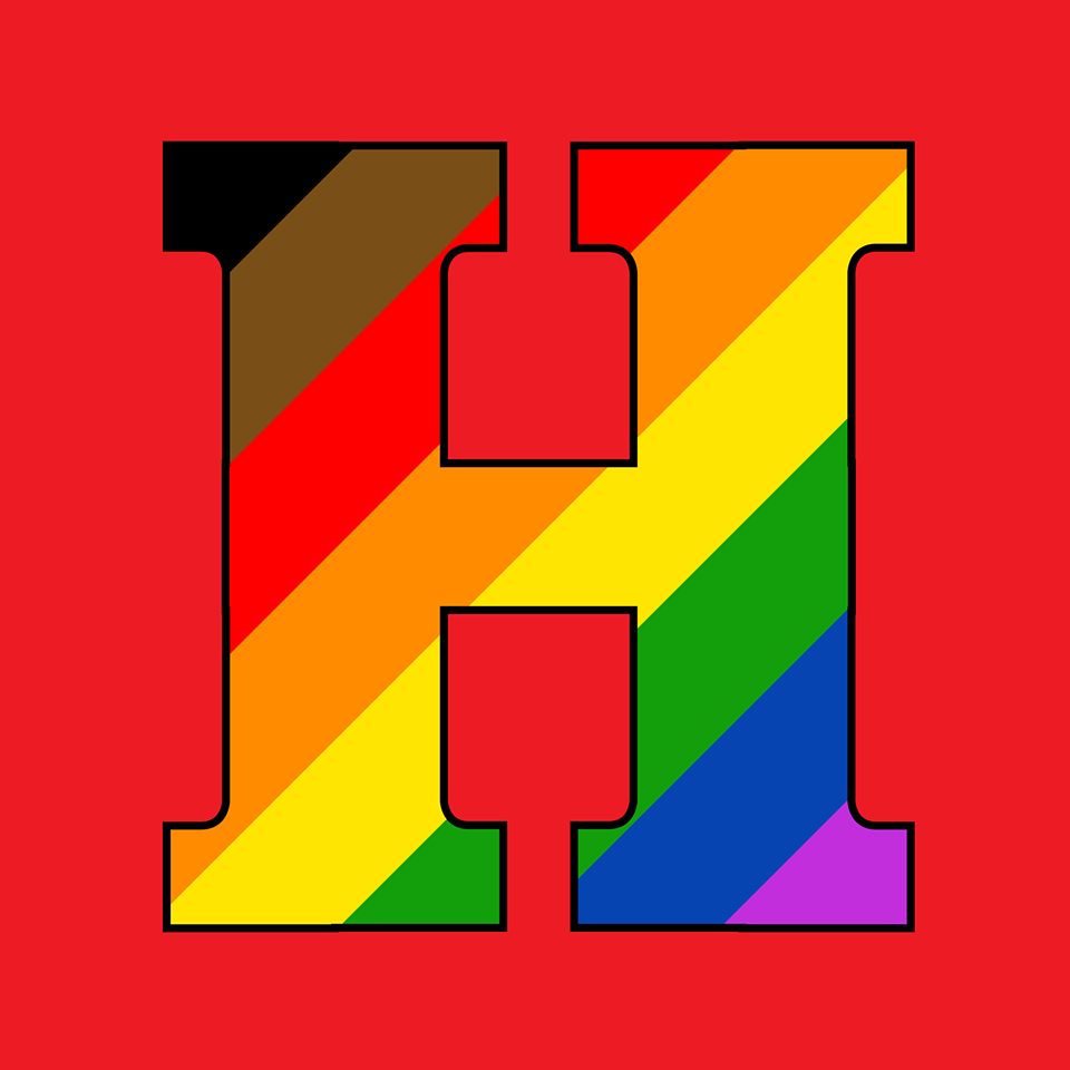
HIngham Pride Logo: The letter H filled in with diagonal colors of black, brown, red, orange, yellow, green, blue and purple. Background is red which is the Hingham school color.
I hope you all like the new addition of the Hingham Pride Project’s official logo created by Lauren Kourafas. Some of you might have noticed that this is not the standard rainbow flag, typically seen as a symbol of LGBTQ+ pride. In 2017, for Pride month (June), Philadelphia added two more colors to the existing flag: black and brown. According to the Philadelphia Office of LGBT Affairs’ More Color More Pride campaign, the colors represent inclusion of people of color in the LGBTQ+ community. “In 1978, artist Gilbert Baker designed the original rainbow flag,” the campaign states. “So much has happened since then. A lot of good, but there’s more we can do. Especially when it comes to recognizing people of color in the LGBTQ+ community. To fuel this important conversation, we’ve expanded the colors of the flag to include black and brown.” This flag has not been without great controversy. However, we agree that there is more we can do to be inclusive, want to recognize people of color in the LGBTQ+ community, and further educate our community while we celebrate pride. Here is a link to show your pride as part of your profile picture: www.facebook.com/profilepicframes/?selected_overlay_id=2450053525106658